Yoshitoshi Kanemaki

Kanemaki is a Japanese fine artist who specialises in sculpture, often using wooden carving techniques. He uses an equal balance of bones and living humans combined in his sculptures, which portray the questions of 'what is life?' and 'what is death?'. The idea of centring a piece of work around ideas of death and the role it has on people is what makes pieces like Kanemaki's eerily disturbing.The way that the skeleton is hanging over the boy makes it seem as though death is looming over him, and the way that you cannot see his eyes, and only see a blank expression on his mouth also adds to the disturbing connotations that Kanemaki's work has.
The actual style of carved wood and paint makes the sculptures seem realistic, as well as almost cartoon-like, which relates to my own style of work. 


Mark Ryden

Blending themes of pop culture with techniques reminiscent of the old masters, Mark Ryden has created a singular style that blurs the traditional boundaries between high and low art. His work first garnered attention in the 1990s when he ushered in a new genre of painting, "Pop Surrealism", dragging a host of followers in his wake. Ryden has trumped the initial surrealist strategies by choosing subject matters loaded with cultural connotation.
Ryden's vocabulary ranges from cryptic to cute, treading a fine line between nostalgic cliché and disturbing archetype. Seduced by his infinitely detailed and meticulously glazed surfaces, the viewer is confronted with the juxtaposition of the childhood innocence and the mysterious recesses of the soul. A subtle disquiet inhabits his paintings; the work is achingly beautiful as it hints darker psychic stuff beneath the surface of cultural kitsch. In Ryden's world cherubic girls rub elbows with strange and mysterious figures. Ornately carved frames lend  the paintings a baroque exuberance that adds gravity to their enigmatic themes. (source)
Ryden manages to capture an eerie style and vibe, which is the type of work that I am aiming for, the only difference being how these connotations come from his traditional style of painting and that mine come from the actual storyline and image of the characters in my comic book. 
I like the way that most of his images are portraits, and this shows that he is almost documenting real life, and someone is sat infront of him waiting for there picture to be drawn, which adds a sense of realism to his work, making his characters eerily human and real. 

Alessandro Sicioldr

Sicioldr is an Italian self-taught artist and illustrator born in 1990. His art is often influenced by his interests in the relationship between alchemy and psychology, and his uncanny subjects are images coming from the unconcious, represented by the author through a rigorous style of drawing. (source)
I like how Sicioldr takes incredibly accurately drawn facial features and then creates entirely new bodies for them, where they appear alien-like, with heads twisting around other heads, and, in the example above, looking like unidentifiable objects.
I really like Sicioldr's work, and feel as though if I had spent more time experimenting with my initial ideas he would have influenced my own work a lot more, instead of just looking into Sicioldr.

Roby Dwi Antono

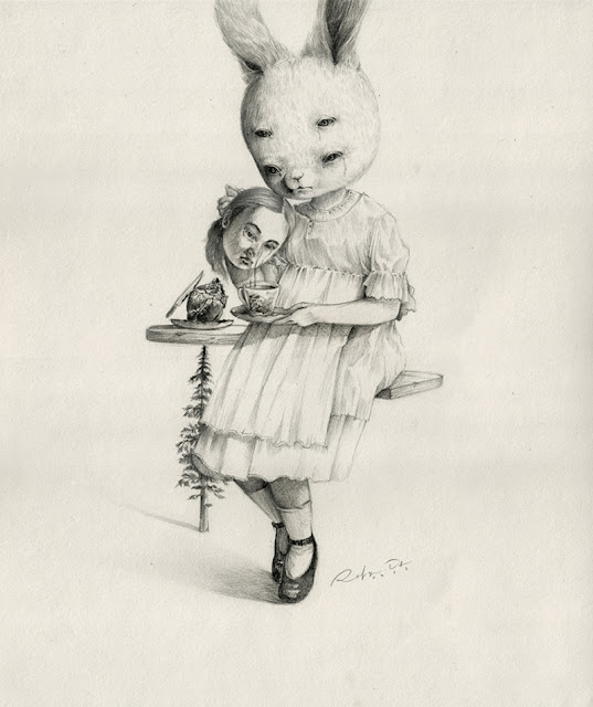
Roby Dwi Antono is an illustrator and graphic designer from Indonesia, who often focuses on animals or children, or an eerie combination of both for her subjects. I really like the clean 'old fashioned' style behind Antono's work, and I would love to incorporate it into my own, but I know that due to my final piece being a comic, using this style would be too time consuming, and it would be hard for me to achieve this style as it is one I am not accustomed too. I also like the use of children, and how this plays on the way that children are often associated with being 'creepy', especially in the pop culture of today, with the biggest example being through horror films. I used Antono as inspiration within my own work as I focused my comic around a child, and followed similar body proportions as Antono through the idea of creating creatures or people with larger heads on thin, underdeveloped bodies.
I like how Antono distorts the features of the subjects of her drawings, and in several images adds extra eyes, which creates almost an optical illusion style. Antono inspired some of my ideas behind incorporating animals and inhuman heads (found in my studio notebook). If I had more time to develop these I would have also been interested in looking into Antono's style and adapting this as well.


Russell Abrahams

Russell Abrahams is a 20 year old student who is an illustrator and graphic design living in Cape Town, South Africa. What I like most about Abrahams work is the line work and the refinement he puts into this, creating detailed, professional imagery using his own found style of mark making. I especially like the image above due to the lack of colour, and how this relates to my own work. This also reassures me that images using only block colours of black and white can be successful. The textures of the skin relate to the development and ideas I did on drips, and dripping skin, and creates an interesting vibe behind this portrait, where the woman seems slightly eerie due to how her skin is almost showing movement. 
Comparing the first image to the image above, I looked into colour and how different colours effect the style and overall intention of a piece. The colours used in this image make the piece have a brighter feel, and make it seem less daunting and make the drips of the skin seem more comical rather than creepy, and even though she has the same expression, this image suggests a mouth open due to surprise and suggests positivity, whereas the black and white image suggests a screaming face, or a face of shock. Due to how colour can change the entire outcome of a piece, this research has led me to be certain of my lack of colour in my work, because within my work I want to create pieces which seem daunting and can make an image seem incredibly negative compared to looking positive.
With this image Abrahams was focusing on subliminal messaging and how children are raised, but follows the same style and technique of 'dripping' skin, just using a different media. I like how the positivity behind the bright colours contradicts the tragic connotations of how children are raised 'around some pretty messed up stuff' (- Abrahams), and I like how the colouring isn't normal (eg: blue hair, bright pink face) and that makes the image seem slightly off or eerie. The wide eyed expression makes the child seem creepy because he appears to be shocked, or staring directly at something.


Silent Hill

Silent Hill is a well known franchise that includes films, video games and comics.The first Silent Hill was released in 1999, which was the first of 8 video games to come. There has also been 6 spin-off video games and 3 re-released games. (source)
What interested me and led me to research the Silent Hill was because of how it is popularly known to have creepy, horrific monsters awaiting the gamer, and how it is an iconic game for survival horror genres. The monsters of Silent Hill are often the main antagonists, and are said to be created when a characters repressed thoughts are manifested by the 'power' behind the town of Silent Hill. 
Most of the Silent Hill monsters are adaptations of the human form where it has been slightly altered to create inhuman monsters. The fact that they are ruthless and devoid of human features (mostly) and human emotions is what adds to them being so creepy. The monsters are often drawn with dark colours to relate to the bleakness of the video game, and this also relates to ideas of the un-dead. Looking at monsters from Silent Hill, I  based some of my earliest ideas on taking the human form and making it look monstrous (as found with some of the images I drew in the beginning of my A3 portfolio) and looking into these also helped when I was planning my main characters image in my comic book, when I was deciding what he mouth would appear to be like. I chose to have a large, dripping mouth with many teeth due to how horrific this looks, and how it could be associated with looking violent. The idea of looking violent was inspired by Silent Hill, due to the violent nature of the monsters of Silent Hill and the way they look.
As seen in the image above, most of the Silent Hill monsters have menacing poses, inhuman features and weaponry, relating how my main character's teeth could be considered weaponry, and this could relate to the fear behind weapons and play on the fact that the audience may fear such things.
Pyramid Head: one of the most iconic Silent Hill monsters


Storyline Research 3: The Path

The Path is a psychological horror video game which depicts a distorted modern day version of Little Red Riding Hood. The player choose to control one of six sisters, who have to make their way to Grandma's house. The player can choose to stay along the path, or to wonder through the forest where wolves are. Each playable character has her own 'wolf' that takes a different form (for example, a middle aged man, or a 'humanoid covered in dark clouds'). (source).
What really interested me about The Path was the visual side of the game, through the use of faded imagery over the screen, and the type of language that the characters used. They appeared to be passive, but still managed to make the audience empathise with them, and become interested in what they considered their 'wolf' to be. I like how they each have subtle back stories that can only be revealed through what their wolf is, and how the entire game is centred around this fear of the unknown, and discovering the character's fears

This image shows an example of the eerie text over the screen, and this combined with the dark colouring and monster-like figure seen in the background are all factors which conclude to create a psychological horror game.
These ideas of poem-like speech are what influenced some of the speaking that is included in my own work through my comic, and the passive way that the characters never talk I also found interesting, and so included in my own work.
The way that the writing is layered over the actual game made me take into consideration layout of my panels in my comic, and what lead me to include figures that sometimes leak over the panels, or don't have one.

Storyline Research 2: The Road


The Road is a post-apocalyptic film based on the novel by the same name by author Cormac McCarthy. It is centred around a nameless father and son in a post-apocalyptic wasteland, struggling to survive. The idea of taking the apocalyptic scenario and combining it with themes of parenthood and family is an interesting combination which could influence my own synopsis in my comic.
Focusing on looking at the storyline of this apocalyptic-themed film, I like the passive idea of using characters with no real names, and the way that these characters are empathised with, despite being very distant to the audience. The fact that there is two main characters (three including the father's deceased wife), puts more focus on these as characters, and leaves more room for them to develop and be shown in various different scenarios. The Road largely inspired my storyline due to its centring around families, and really helped me take into consideration choices about my characters relationships with one another and their family lives and how the apocalyptic scenario has impacted their families.
"A horribly credible, chillingly beautiful and wholly uncompromising drama. It's the end of the world, all right, but no one feels the least bit fine." - (source)


Storyline Research 1: Apocalyptic Fiction

Apocalyptic fiction is a sub-genre of science fiction that depicts the end of human civilisation. When looking into my storyline development of my exhibition piece of a comic, I researched apocalyptic fiction, as the concept of creating a vast wasteland in a post-apocalyptic universe appealed to me and my ideas of understanding how illustration can become unsettling. The daunting idea of the end of human civilisation is something that really interests me, and I feel as though this could be a key concept in my comic work, due to how it relates to bieng 'creepy'. The idea of a small amount of people being the last people on earth relates to the fear of the unknown. The idea of making my work slightly fear-inducing is something I want to be successful.

I started my research by looking at different causes of apocalyptic scenarios, and the most popular ones seemed to be nuclear warfare, extraterrestrial attack, cybernetic revolt, dysgenics, divine judgement, ecological collapse or natural disaster.

Dysgenics looks into the study of the accumulation of defective genes and traits, and this idea of humanity degrading is the precise type of fear that I want to include as a background development in my comic. This idea of disadvantaged genes can also relate to the appearance of my characters, and provides suitable explanation for why they are strangely inhuman - in terms of both appearance and lack of emotions and heighten passiveness.

After researching other options for an apocalypse and settling on dysgenics, I had to focus on the time frame of setting my comic. Looking into a range of post-apocalyptic pieces of fiction, the time range can be varied from immediately after, or considerably later. These would both create different scenarios for my comic, as immediately after is more likely to be focused on the psychological impacts the end of the world has on survivors, whereas if my comic was set considerably later, civilisation before the apocalypse would be more mythological and forgotten. Technology is a key element I need to consider, as I need to include as serious lack of technology. This research has begun to shape ideas of a lone survivor who lives in an empty house with minimal essentials to survive.


Tomek Plonka

Tomek Plonka is an illustrator from Poland who focuses on drawing and toy design. The large focus that Plonka has on using noise in his work to develop inhuman shapes and characters makes his designs have a depth and unease. This is what really draws my attention to his work, and the way he develops inhuman textures with such detail. 
In terms of Plonka applying his illustration focuses to toy design, he manages to successfully create small, character-like pieces with playful proportions, which counteract the nearly-morbid designs on them. These outcomes of 'cute' yet 'dangerous' characters have a mesmerising detail to them, which appeals to a target audience well. The idea that Plonka designs 'toys' using faces that would not be suitable for children is also interesting, and how he uses the context of something that is originally for a child, and targets it at a more adult audience.
In terms of how Plonka has influenced my own progression through stage three, this idea of 'busy' movement and how his work is seen as being 'angry' is a factor that I have looked into. This distortion of human features gives them an eery feel that my whole project is focused around. His use of grainy black and white tones gives a more 'horror' feel, compared to using colour - considering colour is often used to set the mood of an image - this lack of colour makes it seem very passive and distant - which relates to 'emptiness'. The distortion of making 'larger-than-life' faces and characters relates to my work and development into comics and characters and illustration, showing that Plonka was a large influence when I was developing my style during the progression of my work.


Limbo

Limbo is a puzzle-platform video game released in 2010. The player guides an unnamed boy through dangerous environments and traps as he searches for his sister. The style of play can be described as 'trail and death', and Playdead used gruesome imagery for the boys deaths to steer the player from unworkable solutions.
The game is presented in black and white tones, using lighting, film grain effects and minimal ambient sounds to create an eerie atmosphere often associated with the horror genre.
The storyline includes a nameless boy who awakens on the 'edge of hell', where he searches for his sister, finding only few human characters who either attack him, run away or are dead. The forest eventually gives way to a crumbling city environment. On completing the final puzzle, the boy is thrown through a pane of glass and back into the forest. He walks a short distance until he again encounters a girl, who, upon his approach, stands up, startled. At the point, the game ends (source).
The way that LIMBO creates an entire game centred around a character who has no name and no script, and still manages to make the target audience empathise for him is a technique that I aim to create in my own work. LIMBO also plays on the use of spiders and 'creepy crawlies' as potential dangers, which interacts with the audiences possible fears of spiders (relating to my research into what people are afraid of).The way the spider-like creatures in LIMBO are larger than life exaggerates the fears of insects in this surreal universe where phobias are used hyperbole.


Stefan Zsaitsits

Stefan Zsaitsits was born in Austria and attended the University of Arts Vienna (source).  Zsaitsits uses an independent style of pencil, creating characters with large heads and contorted facial features to creatue unsettling images of children, staring blankly into space - in most cases. This creates a successfully eery appearance due to how children are associated with being playful, and in most of Zsaitsits pieces, he makes use of children appearing blank, distressed and unhappy. The way he uses layering of different pencil works creates a ghostly effect to his work, which leads to a passive distance between the audience and the work. This idea of passiveness is what is inspiring my own work, as I develop ideas using blank faces, or faces missing essential facial features. Since discovering Zsaitsits in Stage Three, he has easily become my favourite artist, as every piece combines different objects or manipulations that make each piece engaging and unique.
Stefan takes advantage of pencil as a media by creating realistic detail and tone, making the portraits seem realistic, which contrasts with the large heads and cartoon-like proportions.
The use of children as subjects plays on the idea of how children can be perceived as creepy (for example, when a child says something because they fully don't understand the meaning of what they're saying). And this paired with the use of children performing 'creepy' acts (such as, for example, holding a dead chicken in their mouth) creates an unsettling outcome of a young child involved in an animalistic act. 

Erik Madera

Erik Madera is a freelance graphic designer and illustrator based in Mexico, and has a passion for illustration, typography, tattoos and technology, as shown in his work (source).
Madera takes advantage of elements such as the 'undead', using them in his work to create pieces that have a quirky, unique look about them.
Madera also uses different media to work on such as skateboards and t-shirts, appealing to a target audience of skateboarders, and this also gives him a larger opportunity to collaborate with fashion designers.
In terms of Madera's commissioned work, he shows a busy style exaggerated by his use of bright colours and bold line work. This boldness of his work relates and communicates with the actual subject of his works, as he makes use of bold topics to draw about. 
Madera is trying to communicate the creation of unusual work that, in a way, shocks the audience, and this is communicated through the use of skulls and snakes, and other unsettling objects. The colours behind this particular piece above gives the image a brighter feel, and if black and white were used instead, I think that the piece itself would have appeared more darker and have a sinister vibe.


Salad Fingers

Salad Fingers is an animation series created in 2004 which gained rapid popularity in 2005 via the internet. The cartoon revolves around the character Salad Fingers, a thin green, mentally troubled humanoid who inhabits a desolate world. His long strangely shaped fingers are his most notable feature, and is unable or unwilling to distinguish between living beings and inanimate objects, and is frequently found talking to various inert articles (such as finger puppets). He lives alone in a small shack, and can speak fluent french. He sometimes displays raspy asthmatic-like breathing when mesmerised with something or experiences extreme pleasure. (source)
Salad Fingers style of animation is drawn in quite an 'eery' way, through the hunched back and distorted human characteristics such as long fingers and exaggerated facial features. The lack of detail used to create Salad Fingers makes it seem almost like a child has drawn it, adding to the 'creepy' factor that it contains. 
In terms of the background and personality of Salad Fingers as a character, the research and traits he has are very in depth and thought out, and this depth of character development is something that I want to aspire to create within my own work and my own final piece. 
The  use of internet as a media used for Salad Fingers is successful due to how this increases his popularity (in terms of how popularity would be lessened if he was part of a zine or comic or book) and it shows that creator David Firth has taken advantage of this platform of media, spreading his episodes of Salad Fingers across several different websites. 


DZO Olivier

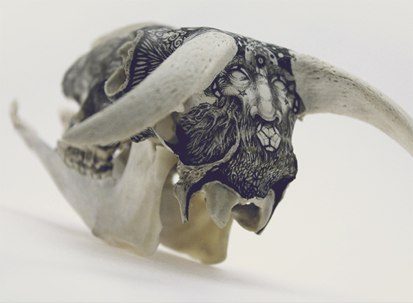
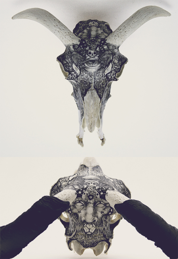
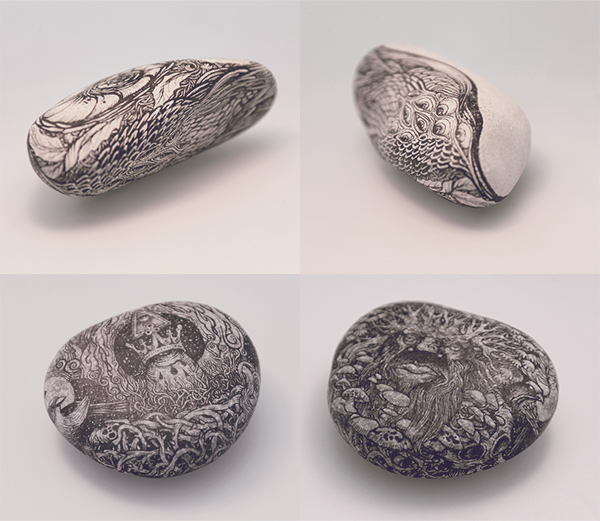
"I always varied pens but rarely drawing surfaces. Out of paper for a short time, I turned to the two inert materials: stone and bone. These materials are still "living" materials: rough, bold, smooth, cracked, absorbent. Taming the variety of surfaces on a volume is a real adventure. 
So I put aside the paper and canvas fabric to experiment with new drawing sensations. Hand fits. The fingers feel every bump. The spirit leaves guided by reliefs. The tip of the pen folds and unfolds. I even had the feeling that this matter thanks me for taking care of it. 
Today I look differently. I understand them differently. This experience has enriched my own drawing skills. The "inert and dead" matter, gave me some lessons." (source)
DZO Olivier's use of different materials led me to experiment with drawing on leaves for a brief period of time at the early stages of Stage 3. This was the point of the stage where I was unsure of my plans for development, and so had a short experimental phase looking at drawing depictions of death on living things such as leaves. Olivier pays close attention to detail in this set of works, using simple medias like pen to create detailed work. 
Olivier's work with paper is just as engaging, as he researches skulls of animals and combines them with humans to create an entirely new species of dehumanised characters and subjects. All of his work contains several different elements, making no part of it the main focus, and this idea of his work being busy gives it more of a depth and makes it extremely engaging to look at. 


Choi Xooang


All at once delicate and nightmarish these painted polymer clay figures by Choi Xooang are nothing short of remarkable. Xooang is attempting to draw attention to human rights abuses in Korea, and seeing this somewhat macabre, stunted figures unable to see or speak, its hard to dispute that. (source)

Xooang's sculptures show incredibly realistic features with slightly de-human changes to them, with hollowing eyes and smoothed over mouths. The unsettling way these photographs are taken makes the sculptures looking right into the viewers eyes, making the audience feel unsettled. The way that Choi Xooang's work manages to portray this idea abuse in Korea through distortion of human figures makes his pieces hard hitting and controversial.
 This successful idea of eeriness that Xooang contains in his work is something that I aim to create in my own, and I feel that producing work with this much unsettlement has good possibilities of narrative and development within them.


Jaume Montserrat

After investigating what causes things to be categorised as 'creepy', Montserrat's 2012 set entitled 'Move' suits these conventions well, through the use of blanked out eyes, causing this child to be less human, looking emptier than the average human look, which associates with the Uncanny Valley theory.
The use of detailed pen work with some aspects of these images but not with others (such as the blank clothing) gives this set a ghostly feel, and the plain expressions depicted make these subjects seem almost zombie-like creatures lacking human empathy.

Montserrat's most recent set of images (entitled Emptyland) use ribbon-like effects to 'void' each animal, giving them a hollow effect, relating to the ideas of animals lacking human emotions. 

"I conclude therefore that in that empty space we were all immortal, a difficult feeling to assimilate. I devoted myself to outline and analyse my surroundings, and with this I developed Empty Animals. I learned to live with them, no worries, no need to feed. And I missed pondering the existence of a God, and the idea of a Darwinian evolutionary process in parallel, or just enjoy the freedom of an empty reality. Arriving in Barcelona I decided to lock them in a drawer and not say anything about this to anyone, and now, two years later, after trying many times to go back there, I have come to the following conclusion: if I, who have already been can not return, no one can go." (source)


Research into Conventions of the 'Creepy' Factor

As Stage 3 develops, so do my interests in aiming to making pieces of work which relate to being 'creepy' as a theme. From this, I am investigating what really makes something eery, and what conventions are used to making something have a certain 'shock' factor about it.
Investigating the most common fears found in people, the most popular fear found is Arachnophobia: the fear of spiders. This phobia tends to effect women more than men, and this fear includes feeling uneasy when faced with a space where spiders may be situated or seeing webs. Bad cases of arachnophobia include panic attacks or having trouble breathing when faced with their fear.
Typical spiders have traits such as long legs and fine hairs, and this idea of long, 'creeping' limbs is what has influenced my own work when developing my style when drawing the human body, where I have developed methods of exaggerating the length of limbs and the number of joints in the arms and legs of the body.
Photo by Jimmy Kong
Things that are often associated with being creepy are concepts where the content is slightly different from the normal standard, such as characters behaving passively and odd. The idea of having 2-D emotions where characters are restricted of the variety of emotions that humans display gives things a certain vagueness, which relates to mystery - a factor commonly associated with techniques of horror or creepy-ness. (The use of the 'fear of the unknown' technique commonly found in pop culture).

Creepy is an ambiguous term that more often than not needs to be defined individually, but when researching different ways and things different people find creepy, more commonly than not the idea of distorting reality by a small fraction turns something from being an average piece of work to being eery and unsettling. 'Creepy' can be developed into several different ways, one where the source of fear is unknown, hidden, and leaves the audience psychologically chilled, and the other technique of gore and shock which creates a 'straight-up' creep vibe. Creepy things suggest connotations of characters with 'no escape' and dark topics that are unsettling to read. Using things such as taboo topics in work to making something shocking and unsettling.
Short stories manipulating the idea of the unknown
Other concepts that are considered creepy include vivdly showing something that effects the human body directly, and this idea of relating to the audience is what makes something creepy and unsettling to view. 
Uncanny Valley is the hypothesis that suggests that when human features look and move almost, but not exactly, like natural human beings, it causes a response of unease or revulsion amongst some human observers. Examples of this can be found in fields of 3D computer animation, robotics and burn reconstruction. The 'valley' refers to the dip in a graphic of the comfort level of humans as subjects move towards a healthy human-like appearance. 
The uncanny valley is the region of negative emotional response towards robots that seem 'almost human'. Movement in such objects amplifies the emotional response. (source)
The term was coined by Masahiro Mori in 1970, who predicted that as the appearance of a robot becomes more human, the observers emotional response will become increasingly positive until the likeness reaches a point where slight imperfections are emphasised and the emotional response becomes overwhelmingly negative. When human likeness becomes 100% accurate the emotional response curves upwards to more positive responses. (source)

Vince Locke


Locke began working in 1986, illustrating zombie horror comic Deadworld, which became an underground hit. Since then he has done work on several different comics, including one Judge Dredd story. He gains notoriety by creating ultra-violey watercolour paintings for album covers and for dark-fantasy novels. (source)
Locke's use of imaginative play with surreal creatures gives all his works a chilling feel and a shock factor that makes his pieces memorable. He uses the idea of taking the human form and distorting it into something shocking and horrific, using conventions of horror. The research into what makes something chilling is evidential in his work, and his use of snarling, slimy creatures show a real sense of style and character in his work.


'Disturbing' Graphic Novel Research 2: Bodyworld

Bodyworld (Dash Shaw)
The style used by Shaw in body world is different to traditional comic technique, by using less 'sketchy' marks and manipulating the use of colour for backgrounds, and using white colours for the foreground and character colouring. This shows how the techniques of comics have developed over the years, when you compare the style of Maus with the style of Bodyworld

The way that Shaw uses an entirely new universe to base his surreal comic synopsis in makes Body world seem well thought out and developed. Shaw has a unique style of illustration which is well established and makes Body World memorable and modern. The idea of combining real situations such as drug use and addiction and intertwining them with a 'reality' set years in the future with surreal, imaginative and unlikely side effects turns this piece of work into an almost 'dream-like' reality, with a story which has a suitable development pace and controversial content of fictional drug use. 

'Disturbing' Graphic Novels Research 1: Maus

Maus (Art Spiegelman)


MAUS is a graphic novel from 1991, which tells the story of Spiegelman interviewing his father about his experiences as a Holocaust survivor. The book is said to use 'post modern techniques, such as its deception of races of humans as different kinds of animals' (Jew's are mice, Germans are cats, and non-Jewish Poles as pigs). (source) 

The way that Spiegelman uses illustration makes the story seem more chilling, due to the monochrome colouring and use of animals to exaggerate the racism between Germans and Jews at the time of World War II. This makes the comic seem more controversial to the public viewing, and the idea of a comic being so hard-hitting and deeply scary and touching through themes and topics that the public find upsetting is an idea that I could consider for my own work with graphic novels and comics.